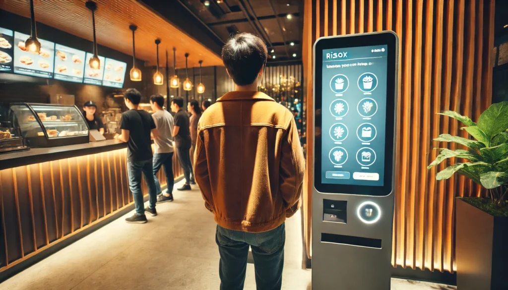
In the fast-paced world of the restaurant industry, your kiosk menu is the cornerstone of your guest’s interaction. This essential component can significantly influence the dining experience, determining whether guests will leave satisfied and eager to return. Ensuring your kiosk menu is simple to navigate, easy to understand, and visually appealing can make all the difference. Here’s how you can achieve this:
Simplify Navigation
A user-friendly interface is the first step in creating an effective kiosk menu. Guests should be able to find what they’re looking for without any hassle. Here are some tips to simplify navigation:
- Organize by Category: Group similar items together. For instance, have separate sections for appetizers, main courses, desserts, and beverages.
- Logical Flow: Arrange the menu items in a logical order that mimics a traditional dining experience, guiding guests from starters to main dishes to desserts.
- Search Functionality: Incorporate a search bar that allows guests to quickly find specific items or ingredients.
Ensure Clarity
Clarity is crucial in menu design. Guests should immediately understand what each item is, what it contains, and its price. Achieving clarity involves:
- Clear Descriptions: Write concise and descriptive item names and descriptions. Avoid jargon and ensure any dietary information is clearly marked.
- Readable Fonts: Use large, legible fonts. Avoid overly decorative fonts that might be hard to read.
- Straightforward Pricing: Clearly display prices next to each item. Consider including options for different portion sizes or extras to prevent confusion.
Enhance Visual Appeal
Visual appeal can make your kiosk menu enticing, encouraging guests to order more. Here’s how you can make your menu visually appealing:
- High-Quality Images: Include high-quality images of your best-selling dishes. Ensure these images are well-lit and appetizing.
- Consistent Branding: Use colors and design elements that match your restaurant’s branding. Consistency creates a professional and cohesive look.
- Highlight Specials: Use visual cues like borders or different background colors to highlight special items or promotions.
Test and Optimize
Finally, regularly test and optimize your kiosk menu based on guest feedback and sales data. Conducting user testing can provide valuable insights into how guests interact with your menu and where improvements can be made.
- Gather Feedback: Use surveys or comment sections to gather feedback directly from guests.
- Analyze Data: Look at sales data to identify which items are most popular and which might need better visibility or a revised description.
- Continuous Improvement: Regularly update your menu based on feedback and data to keep it relevant and user-friendly.
Conclusion
Your kiosk menu is a critical element of your restaurant’s guest experience. By focusing on simplicity, clarity, and visual appeal, you can create a menu that not only enhances guest satisfaction but also boosts your sales. Remember, a well-designed kiosk menu is not just a list of dishes; it’s a key tool for engaging with your guests and ensuring they have a memorable dining experience.


